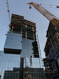
Carr Properties' 7272 Wisconsin Avenue project is beginning to give a hint at the striking design promised in the original renderings. Here we are mainly looking at The Wilson, the Class A office tower at the front of the development. Directly next to it is The Elm, a residential tower of the same height.


I thought you said the new Bethesda Sector Plan and Design Guidelines we’re poorly written and would produce boring boxy “pack and stack” architecture. The Wilson and the Elm are starting to look pretty damn cool to me...
ReplyDeleteEvil Mr. Burns building is blocking my sunshine... #FightThePower
ReplyDeleteHave you ever considered putting your posts with lots of photos behind a "read more" tag after the first image and paragraph? I know wordpress has this feature but am not sure about blogger, so this might be an irrelevant question. I'm more interested in retail/restaurant news than construction, which is why I thought of it. It doesn't take long to scroll, though, so it's not a big deal. But it would be awesome, so I thought I'd ask anyway. :)
ReplyDelete7:03: I did say that - 7272 Wisconsin was designed long before the Bethesda Downtown Plan was passed.
ReplyDeleteBut the Elm and Wilson are clearly using the same architectural and planning ideas that are recommended in the Bethesda Downtown Plan. Namely a four or five story base, then a setback middle sectoin, and topped by an interesting architectural feature. The project is using the new allowable height established by the plan, further amended from 250’ to 290’ as part of the Purple Line Minor Master Plan Amendment.
ReplyDeleteThe Wilson has a unique glass clad enclosure of the retail and above grade parking, with decorative vertical metal fins. Above that, the tower is setback, and has multiple recesses and cantilevered elements to give it definition, and outdoor terraces for office tenants. On the top it has a large roof terrace adjacent to the mechanical penthouse.
The Elm also has a large base that is being clad in dark grey brick, then setbacks to a more sleek middle section, that splits into two towers, and a unique top that is articulated with a glass clad bridge, that connects the towers.
The two residential and one office towers have required tower separation that is recommended in the plan. Tower separation for high rises ensures views and preserves natural light. Tower setbacks above a base create a more humane streetscape, and enable enticing rooftop terraces at the steps.
This project was reviewed by the Design Advisory Panel, which was established as part of the new Sector Plan. the DAP felt that the design was clearly in line with recommendations of of the plan. The Montgomery County Planning Commission agreed, and actually placed a rendering of the project on the wall of their board room as an example of a project that was envisioned by the new plan.
Clearly the design and development was influenced and informed by the downtown plan that was being written at the same time, and serves a very good example of what can be built following the plan recommendations.
Of course all master plans can create unintended consequences, but in this case, I believe that the plan creates a great framework for the thoughtful and considered development of our downtown.
8:18: Those discussions took place long after Robert Sponseller presented the design for 7272 at a pre-submittal meeting. The base of this particular project is driven more by the use of those lower floors rather than as an aesthetic goal. If anything, the amateur-hour planning folks glommed onto the base idea after seeing it used here with a 290' height, to provide that talking point that somehow human scale is being preserved via the base-tower separation, so their developer buddies could still get what they wanted while trying to fool the public.
ReplyDeleteVery few of the projects submitted under the later-adopted master plan stack up to 7272 Wisconsin, with the exceptions of the Metro Tower next door, and the Donohoe biotech office building coming to mind.
Most of the rest are indistinguishable from each other, a clear failure of the narrow design choices encouraged by the lackluster master plan.
I am really curious about which new or proposed buildings are indistinguishable from each other? You must realize that most residential buildings typically have a certain rhythm of large and small windows, typically living rooms and bedrooms, which are usually stacked vertically. This tends to make these buildings look similar. a Stacked balconies also are often used. But really, there are buildings that you can’t identify as being unique?
ReplyDeleteI would agree that once they expand the 7900 Wisconsin building with the adjacent 8000 Artena and Toll Brothers buildings, it might be hard to tell where they each start and stop. But otherwise I would say that most new or planned buildings all look unique to me. Of course some communities have some very oddly shaped buildings, like the new office tower in Reston.
Nice, that's where the new Fox 5 studio will be!
ReplyDelete